Spring is here – let’s celebrate the Pantone color of the year!
Elle Decor magazine published an article in December of last year saying “The Pantone Color of the Year represents refreshment, rejuvenation and rebirth. This years youthful hue is also grounded enough to be neutral against many other storied shades we have a history of loving.” “This shade of green called “Greenery” has vibrancy and a little bit of brightness. It is meant to evoke thoughts of flourishing foliage and, in turn, fresh beginnings.” “There is an understanding, now, that you can use green as a neutral color, just as mother nature does. Because of its inherently neutral traits, Greenery can be used in large or small doses, with or without other neutrals, and as an accent or foundation for other color schemes.”
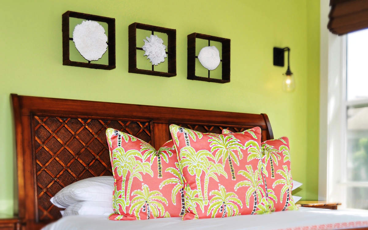
I have always loved fresh greens, and because of their versatility, have easily incorporated them into many of my interior design projects throughout the years. I have found that my clients never tire of a cheerful green and it is universally appealing because it is a color found in nature.
This color pairs well with other botanical and floral colors, including pinks, corals, orchid purple, and tangerine orange. Another popular combination that is very coastal and beachy, is bright green paired with shades of blue, from turquoise and cobalt, to rich navy hues.
Here on Kaua’i, we have an abundance of lush greenery all around us, and I am always inspired by the variety of shades of green that can be found on the Garden Island!
")